Tailwind Marketing
The Mission
This platform helps schools, nonprofits, and community organizations raise funds through real-world cleanup drives.
Project Goal
This project focused on rebuilding the platform experience so users could understand the fundraiser faster and take action with less confusion.
Our challenge
Industry
Nonprofit / Environmental Initiatives
Type of work
Website Planning, UX Structuring, Development Support, Responsive Platform Experience
Core outcome
A cleanup fundraiser platform redesigned to help schools, nonprofits, and community organizations organize events, access resources, manage participation, and move through the fundraising process with far less friction.

The client’s challenge
The cleanup fundraiser platform had a lot to communicate; it needed to explain the fundraiser, speak to multiple audience types, support event organizers, provide resources, answer common questions, and encourage users to take the next step.
The information existed, but the experience was not structured clearly enough around how users make decisions.
The platform did not need more content; it needed a clearer system for organizing and presenting that content.
Fixing The Website
1. Defining The User Journey First
Before restructuring the pages, we mapped how different users needed to move through the platform.
There were three main audience groups:
Schools
Non-profits
Community organizations
Each group had a different reason for participating, but the core journey was similar:
Understand the fundraiser → Identify the right path → Learn how participation works → Access resources → Take action
This gave the website a strong foundation. Instead of making every page explain everything, each page could support a specific stage of the journey.
2. Assigning a Clear Role To Each Page
The homepage was structured to introduce the fundraiser quickly and help first-time visitors understand the idea without overwhelming them.
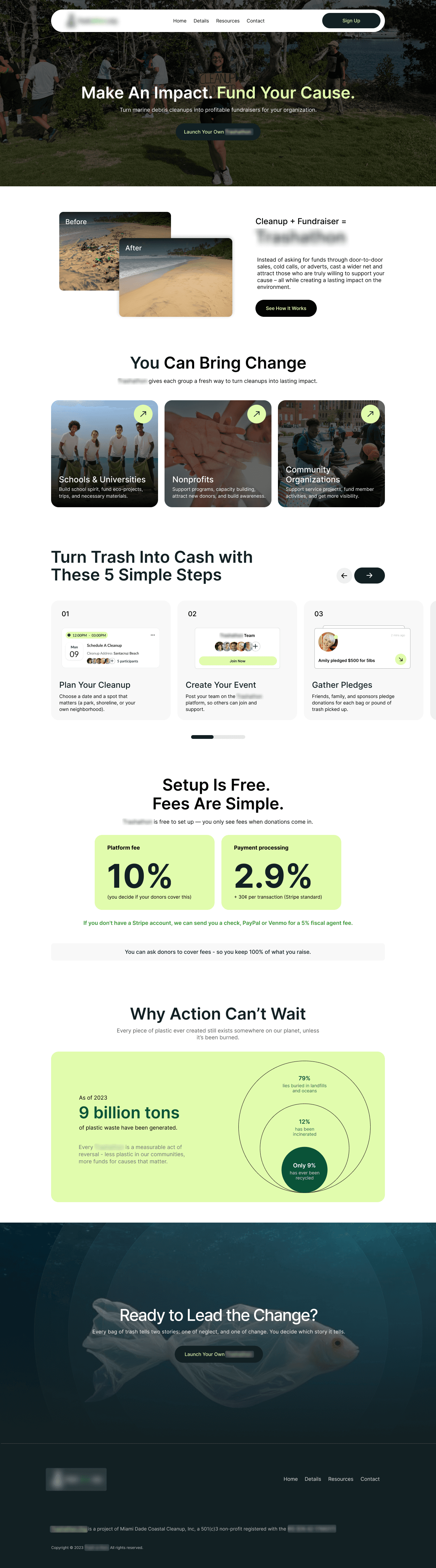
Audience-specific pages were used to explain how the fundraiser platform caters to different groups:
Schools looking for alternative fundraising options
Nonprofits organizing cleanup-led initiatives
Community organizations involving local participants
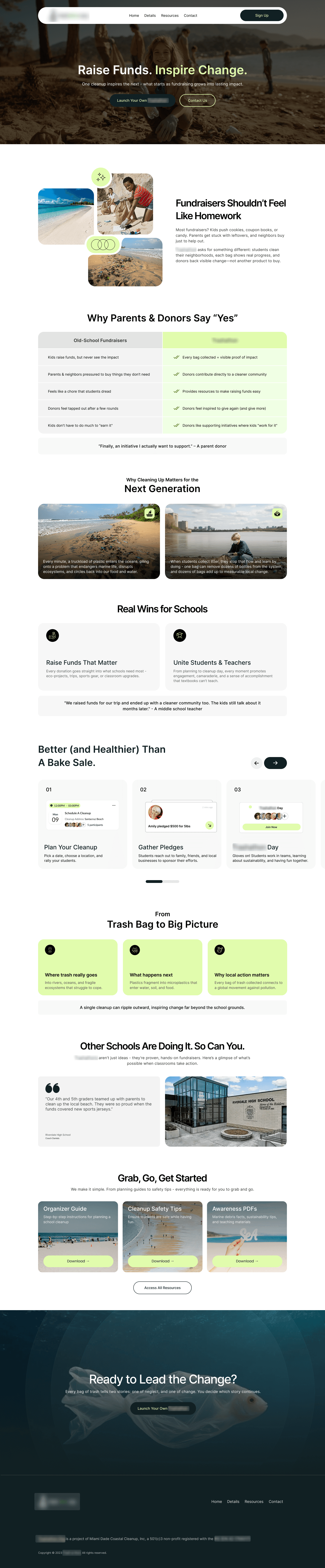
Supporting pages handled the deeper details, including resources, FAQs, participation guidance, and organizer information.
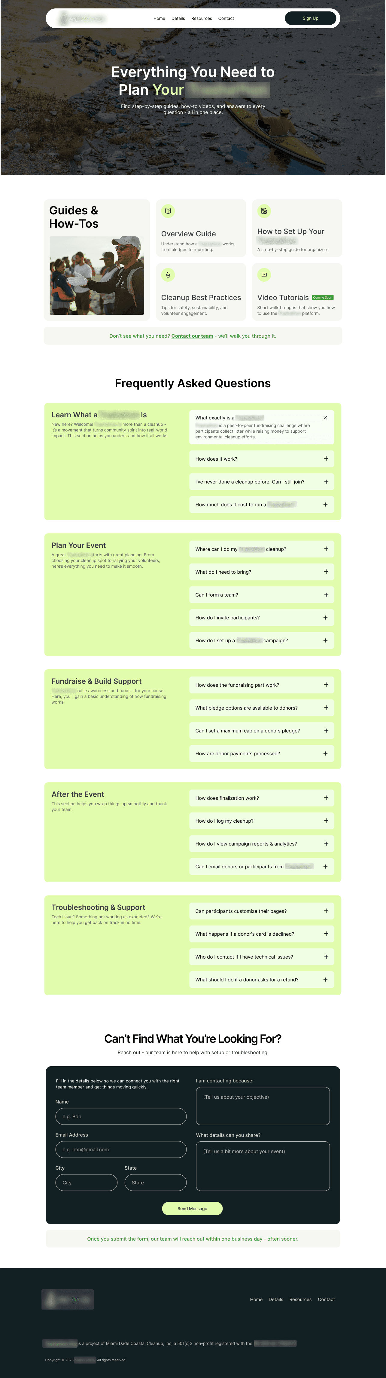
This reduced repetition and made the platform easier to navigate as a complete experience.
3. Organizing Content Around Decisions
All information on the site would render useless if users didn’t see it at the right time.
We restructured content-heavy sections so people could scan, compare, and move forward without having to search through long pages.
This included:
Breaking large sections into clearer content groups
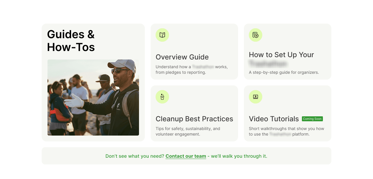
Simplifying comparisons into easier-to-read formats
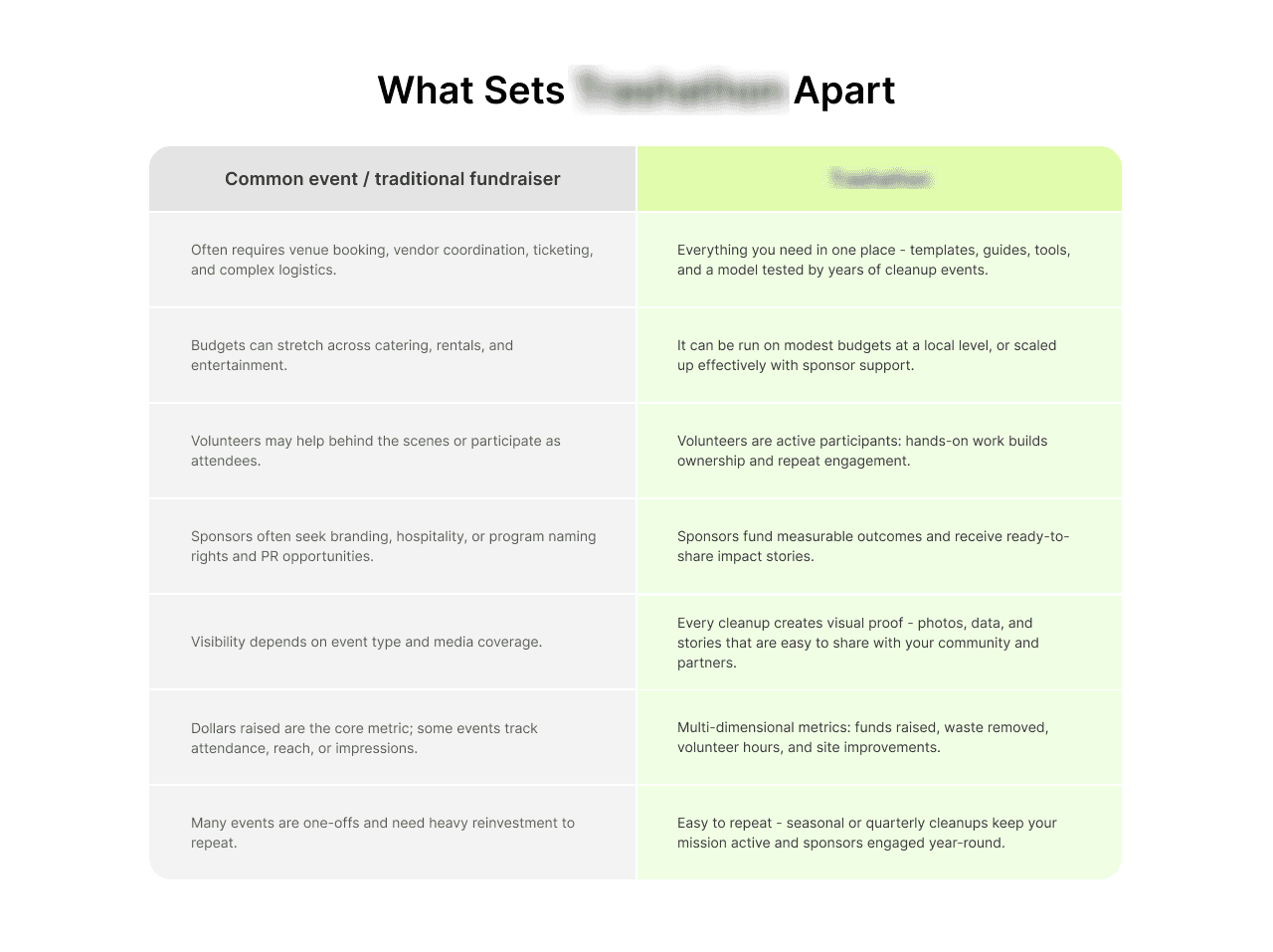
Grouping impact statistics more intentionally
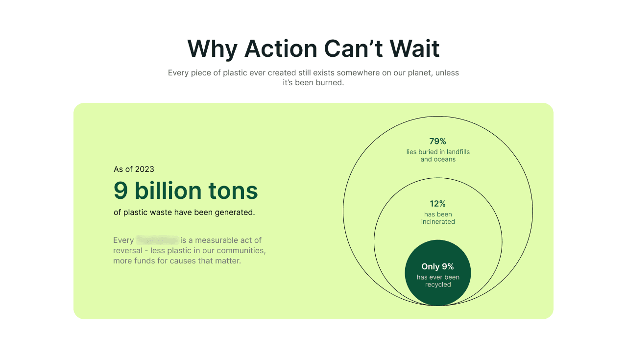
Placing signup actions closer to relevant participation sections
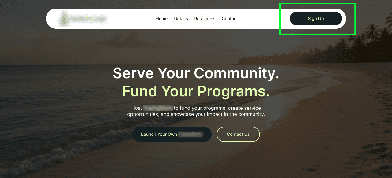
Keeping resources connected to the parts of the journey where users would need them
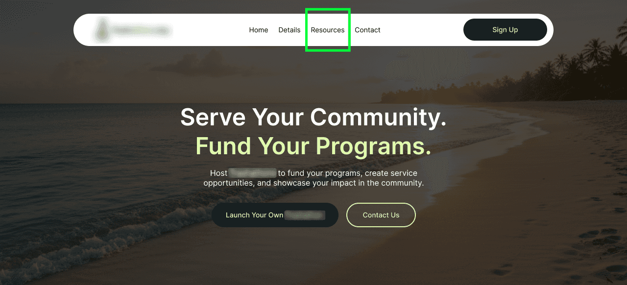
The goal was to make the next step easier to understand without removing important information.
4. Building a Cleaner WordPress Setup
The site had to hold a significant amount of crucial content in one place.
So, the WordPress build was planned around making that information easier to manage and easier to connect across the platform, all while maintaining speed, responsiveness, and structure - even after launch.
We set up the pages so the team could keep adding resources and campaign-related updates without turning the website into a collection of disconnected pages.
5. Keeping the Experience Consistent Across Mobile
A large portion of users would access the platform through mobile devices, often during actual cleanup events themselves. The platform needed to remain usable during real participation.
We created separate mobile layouts to preserve the same sense of continuity we had built into the desktop experience.
This helped us:
keep CTAs visible and easier to access
tighten spacing across longer pages
simplify navigation paths
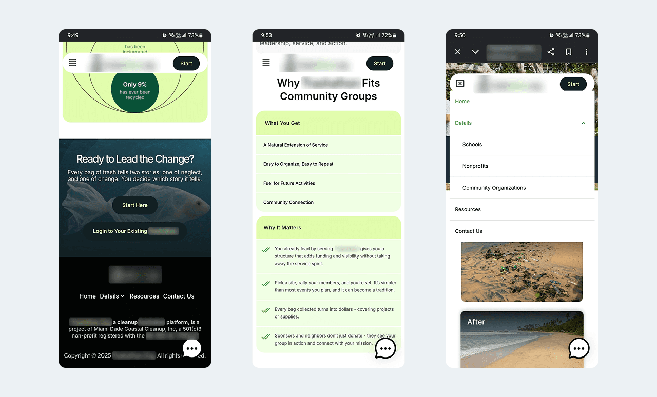
This became really important in resource-heavy sections and participation-related pages where users needed quick access during live event activity.
The Outcome
The cleanup fundraiser platform now has a visual guide that is easier to understand, easier to navigate, and easier to build on.
The rebuild focused on removing the gap between understanding the fundraiser and actually participating in it. That is where the website needed to do the most work.
For the internal team, the platform is also more structured. As new resources, events, and audience-specific content are added, the website has a clearer foundation to support that growth.